Strava: The Experience Layer

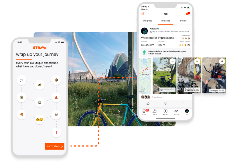
Broadening the Horizon for the Everyday Urban Cyclist
The Challenge: Strava was engineered for the competitive athlete, but the "Great Bike Boom" has shifted the user base. Today’s platform serves a massive influx of urban explorers, commuters, and digital nomads. For these users, the value of a ride isn't found in a PR (Personal Record), but in the texture of the journey.
The Strategic Solution: I proposed a Qualitative Layer—a lightweight storytelling feature that allows riders to pin "micro-moments" to their GPS routes. This transforms a sterile polyline into a rich, personal archive of urban mobility.
The Outcome: A high-fidelity feature expansion that increases retention for casual riders without diluting the data-rich experience that elite athletes rely on.
🚲 The Brief: Designing for the "New" Cyclist
The modern rider cares about the "Why" and the "What," not just the "How Fast."
- The Commuter: Marking a new safe bike lane or a favorite coffee stop.
- The Urban Explorer: Documenting street art or a sudden "serendipity" detour.
- The Weekend Warrior: Capturing the scenery that made the climb worth it.
"Metrics tell you how your body performed; Moments tell you why the ride mattered."
The Concept: Strava Experiences
A non-intrusive content layer that lets riders pin micro-stories directly onto their activity map.
How it works:
- Contextual Pins: Snap a photo and drop it exactly where it happened on the route.
- Mood & Rituals: Tag moments with "Ritual Route," "Detour," or "Urban Discovery."
- The 'Experience' Feed: A visual overlay that complements the standard elevation and pace charts.
🛠 Design Principles
1. From Metrics to Moments
I shifted the focus from purely quantitative data (elevation gain) to qualitative value (elevation of spirit).
2. Low Friction, High Meaning
In urban cycling, safety and flow are paramount. The interaction is designed to be completed in a few taps, ensuring the storytelling doesn't interrupt the ride.
3. The "Do No Harm" Constraint
I utilized existing Strava UI patterns and ensured the core workout tracking UI remained untouched. This ensures the feature is additive for those who want it, and invisible for those who don't.
The Process
Tools: Figma, Strava UI patterns
Approach: Additive storytelling that leverages established design systems to minimize cognitive load during high-activity states.
Demo
The Bigger Picture: Humanizing Mobility Data
This project repositions Strava as a personal journey archive. It imagines a future where:
- Emotional Context is as valued as speed.
- Community is built through shared experiences and "Ritual Routes," not just leaderboards.
- Urban Cycling is celebrated as a lifestyle, not just a workout.
"What if we made space for the unquantifiable moments of a commute?"
🎓 Lessons Learned & Design Reflection
1. Respecting the "Data-First" Heritage
The biggest challenge was adding a qualitative layer without cluttering Strava’s lean, performance-oriented UI. I learned that feature discoverability doesn't have to mean visual dominance. By nesting "Experiences" within existing map interactions, the feature remains additive for commuters while staying invisible to athletes who only care about their segments.
2. Designing for High-Stress Environments
Urban cycling is a high-cognitive-load activity. Every tap matters for safety. This forced me to strip back the "Experience" UI to its absolute essentials. I prioritized large hit-targets and a "capture now, curate later" workflow, ensuring the rider’s primary focus remains on the road, not the screen.
3. Strategic Realignment over Feature Bloat
This project taught me that "Innovation" in UX often means re-contextualizing existing data. I didn't need to invent new sensors; I just needed to give the GPS coordinate a soul. By framing coordinates as "Micro-Moments," we transform Strava from a fitness tracker into a personal mobility archive.
Want to see more of my thinking? View other projects or Let's talk about human-centered design ✨